If you've ever tried to compare multiple metrics across categories in Notion — like team skill sets, product feature scores, or competitive benchmarks — you've probably hit a wall. Notion doesn't support radar charts (also known as spider charts or web charts) natively, and that's a problem for anyone who needs to visualize multi-dimensional data at a glance.
In this guide, we'll walk you through how to create stunning, fully customizable radar charts for Notion using Vizelify Charts — and embed them directly into your workspace.
What Is a Radar Chart?
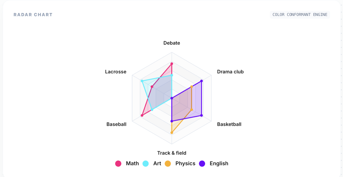
A radar chart displays multivariate data on a two-dimensional plot with three or more quantitative variables represented on axes starting from the same point. Each axis represents a different metric, and the data points are connected to form a polygon.
Radar charts are ideal for:
- Skill assessments: Visualize team member competencies across multiple dimensions (communication, technical skills, leadership, etc.)
- Competitive analysis: Compare your product against competitors across features like pricing, performance, support, and UX
- Performance reviews: Plot employee performance metrics side-by-side on a single chart
- Survey results: Display multi-question survey responses in an intuitive shape
- Product comparisons: Show how different products stack up across specifications
Why Notion Needs Radar Charts
Notion is powerful for storing structured data, but its built-in visualization options are limited to simple databases, galleries, and boards. When you need to answer questions like:
- "How does Candidate A compare to Candidate B across all evaluation criteria?"
- "Which product scores highest across reliability, speed, and cost?"
- "Where are our team's skill gaps?"
A table alone won't cut it. Radar charts turn multi-dimensional comparisons into instant visual insights. Instead of scanning rows and columns, you can see the shape of the data — literally.
Step-by-Step: Create a Radar Chart for Notion
Step 1: Prepare Your Notion Database
Structure your Notion database so that each row represents a category (axis) and each numeric column represents a series (polygon) on the radar chart.
For example, a "Team Skills" database might look like:
| Skill | Alice | Bob | Charlie | |---------------|-------|-----|---------| | Communication | 85 | 70 | 90 | | Technical | 95 | 88 | 72 | | Leadership | 60 | 82 | 78 | | Creativity | 78 | 65 | 88 | | Problem Solving | 90 | 92 | 80 |
Each row becomes a spoke on the radar chart. Each person becomes a colored polygon.
Step 2: Connect to Vizelify Charts
- Log into your Vizelify Charts dashboard
- Navigate to Data Sources and connect your Notion workspace
- Select the database you prepared in Step 1
Vizelify Charts automatically detects your columns and suggests the best chart configuration.
Step 3: Select Radar Chart Type
In the chart builder, select Radar Chart from the chart type selector. Vizelify Charts will instantly generate a preview with your data mapped to the radar axes.
The builder gives you full control over:
- Color palette: Match your brand colors or choose from preset palettes
- Legend position: Toggle and position the legend for clarity
- Data labels: Show or hide values on each axis point
- Theme: Switch between light and dark mode
- Grid lines: Customize the polygon grid appearance
Step 4: Embed into Notion
Once your radar chart looks perfect:
- Click Share & Embed in the Vizelify Charts builder
- Copy the embed URL
- In your Notion page, type
/embedand paste the link
Your live radar chart will render directly inside Notion. When you update the database values, the chart updates automatically.
Radar Chart Use Cases for Notion Users
Team Skill Matrix
Map your entire team's capabilities across dimensions. Instantly spot who excels at what and where training is needed. Overlay multiple team members on one chart for direct comparison.
Sprint Retrospectives
Track iteration quality across dimensions like velocity, code quality, collaboration, and innovation. Compare sprints visually to identify trends.
Vendor Evaluation
Score vendors across criteria like cost, reliability, support response time, and feature completeness. The radar shape makes the winner obvious at a glance.
Student Performance
Educators can plot student performance across subjects. The polygon shape reveals balanced vs. specialized learners immediately.
Why Vizelify Charts for Radar Charts?
Unlike generic charting tools, Vizelify Charts is purpose-built for teams that live in Notion:
- Direct Notion API integration — no CSV exports or manual data entry
- Per-axis scaling — each radar axis scales independently based on your data, so no dimension gets flattened
- Brand-aware styling — apply your Brand Kit colors, fonts, and themes to every chart
- Live embeds — charts update when your Notion data changes
- Export options — download as PNG or SVG for presentations and reports
Tips for Effective Radar Charts
- Keep dimensions between 5-8: Too few axes and you lose the radar shape's power. Too many and it becomes unreadable.
- Normalize your data: If one axis ranges from 0-100 and another from 0-10, the chart becomes misleading. Scale your metrics consistently.
- Limit series to 3-4: Overlapping too many polygons makes the chart cluttered. If you need more, create separate charts.
- Use area fills: Semi-transparent fills help distinguish overlapping series at a glance.
- Label thoughtfully: Short, clear axis labels work best. Abbreviate if needed.
Start Building Radar Charts for Notion Today
Stop squinting at tables trying to compare multi-dimensional data. With Vizelify Charts, you can create beautiful, live-updating radar charts and embed them directly into your Notion workspace in minutes.
Whether you're running skill assessments, competitive analysis, or performance reviews — radar charts give you the visual clarity that tables can't.
Create your first radar chart for free — no credit card required.