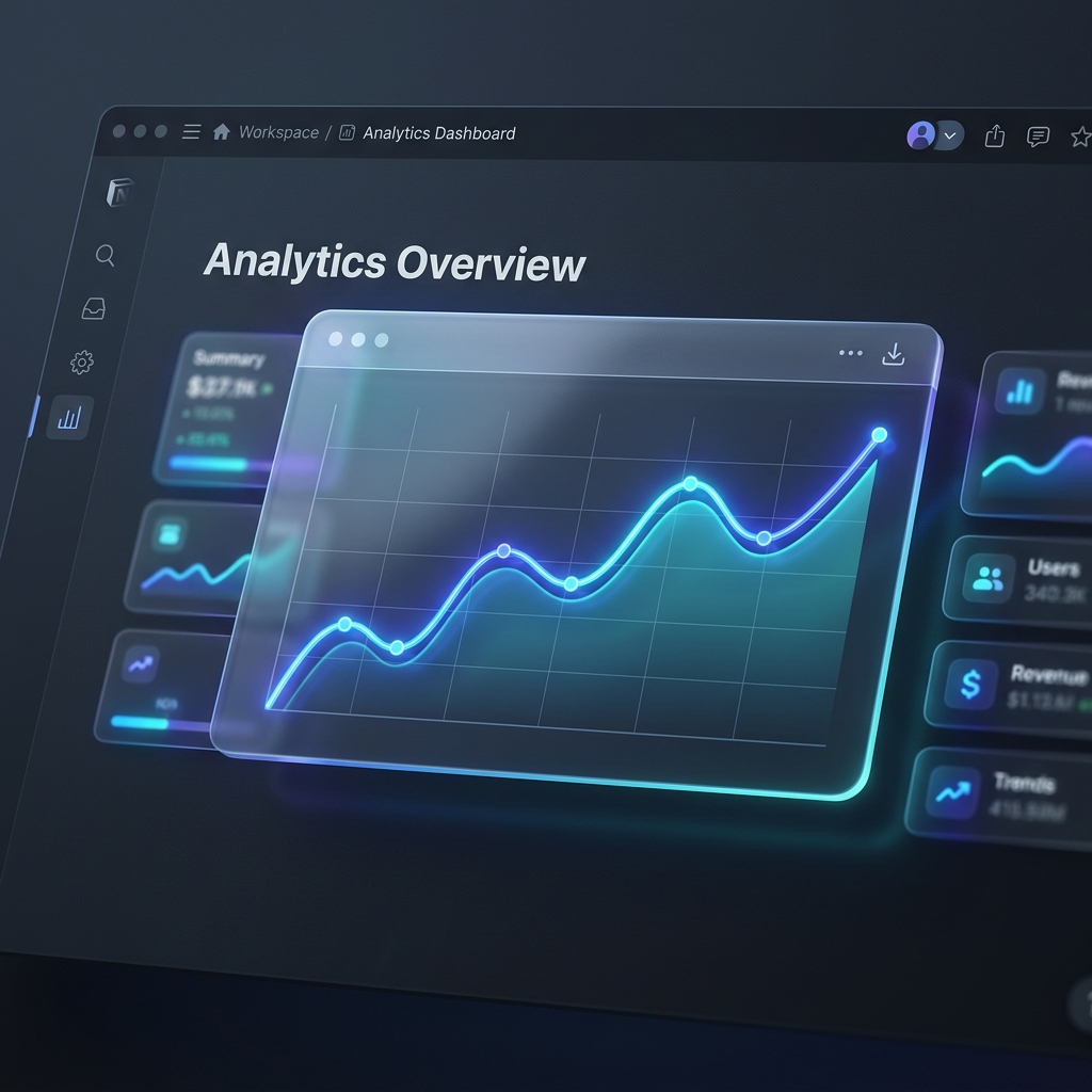
When it comes to analyzing data that changes continuously over time—like MRR growth, active user counts, exercise records, page views, or financial investments—there is no better tool than a line chart or area chart.
These visualizations help you identify long-term patterns, upward or downward trends, spikes, and seasonal drops at a glance. But while Notion excels at tracking databases containing dates, its native UI struggles to show progression over time without complex third-party tools.
In this tutorial, we will show you how to set up time-series databases in Notion, and transform them into gorgeous, auto-updating line and area charts using Vizelify Charts.
When to Choose Line vs. Area Charts
Though they represent similar data structures, they serve slightly different visual purposes:
- Line Charts: Excellent for focusing purely on the rate of change and trendlines across multiple data series. They allow you to compare multiple categories easily without overlap issues.
- Area Charts: Color the space beneath the trendline, emphasizing the overall volume or magnitude of change over time. They are ideal for single series growth (like total revenue) or stacked metrics showing relative contributions to a total sum.
Step 1: Set Up a Date-Based Notion Database
To create a successful time-series chart, your Notion database must contain:
- A Date property type to map along your X-Axis.
- One or more Number property types for the values you want to track along the Y-Axis.
For example, a "Monthly SaaS Growth" database might look like this:
| Month (Date) | Monthly Recurring Revenue (USD) | Active Users | Churn Rate (%) | | :--- | :--- | :--- | :--- | | Jan 1, 2026 | 5000 | 120 | 2.5 | | Feb 1, 2026 | 7200 | 185 | 2.1 | | Mar 1, 2026 | 9800 | 240 | 1.8 | | Apr 1, 2026 | 13500 | 310 | 1.9 |
Step 2: Link Your Workspace to Vizelify Charts
- Create or log into your Vizelify Charts account.
- Head to the Data Sources page and click Connect Notion Workspace.
- Authorize Vizelify Charts to access the specific page or folder containing your date-based database.
- Click Connect.
Step 3: Configure Your Line or Area Chart
- On your dashboard, click Create Chart and select the connected time-series database.
- Select Line Chart or Area Chart from the builder sidebar.
- Configure the X and Y axes:
- X-Axis: Select your
Month (Date)column. You can customize date grouping (daily, weekly, monthly, yearly) inside the builder. - Y-Axis: Select the metric you want to graph (e.g.,
Monthly Recurring Revenue (USD)).
- X-Axis: Select your
- Style the Chart for maximum visual appeal:
- Smooth Curve (Monotone): Enable spline/curve interpolation to give your lines a modern, flowing wave look rather than sharp, rigid corners.
- Custom Gradients: Apply a beautiful, fading gradient fill under your area charts.
- Grid Lines & Markers: Enable grid overlays to make exact values easy to trace. Customize marker sizes so each data point glows subtly on hover.
- Multi-Series Tracking: Plot both
Monthly Recurring RevenueandActive Userson the same chart to cross-reference growth drivers.
Step 4: Embed Directly in Your Notion Page
- Once styled, click the Share & Embed button in the upper right.
- Copy the shareable Live Link.
- Head over to your Notion page or dashboard template.
- Paste the URL, and click Create Embed from the options context menu.
- Drag the corners to expand the widget and make it a central highlight of your dashboard.
Why Vizelify Charts?
Unlike manual spreadsheet setups, Vizelify Charts is designed to keep your Notion pages active and fast:
- True Synchronization: Your charts check your Notion database directly, meaning updates reflect instantly as your workspace grows.
- Ultra-Fast Performance: Embedded widgets load with lightweight canvas renders, keeping your Notion pages snappy and interactive.
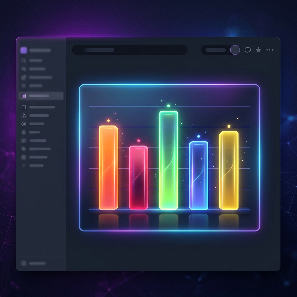
- Sleek, Premium Design: Utilize a gorgeous neon-accented glassmorphism style, custom background filters, and premium typography matching modern SaaS platforms.
Get started tracking your trends dynamically.